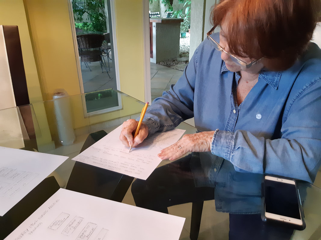
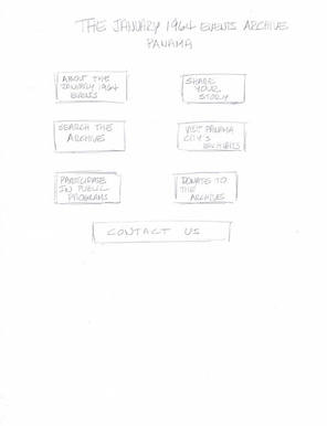
Wireframes/Prototypes
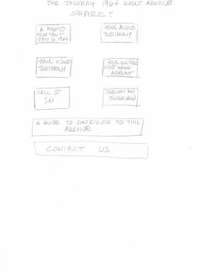
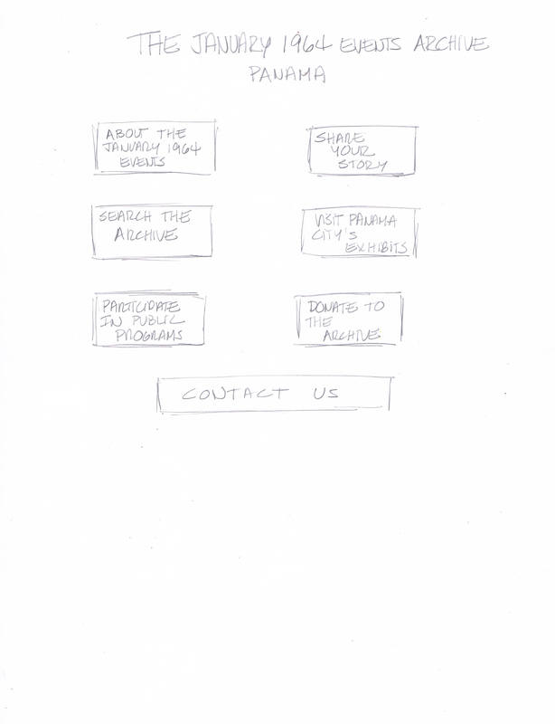
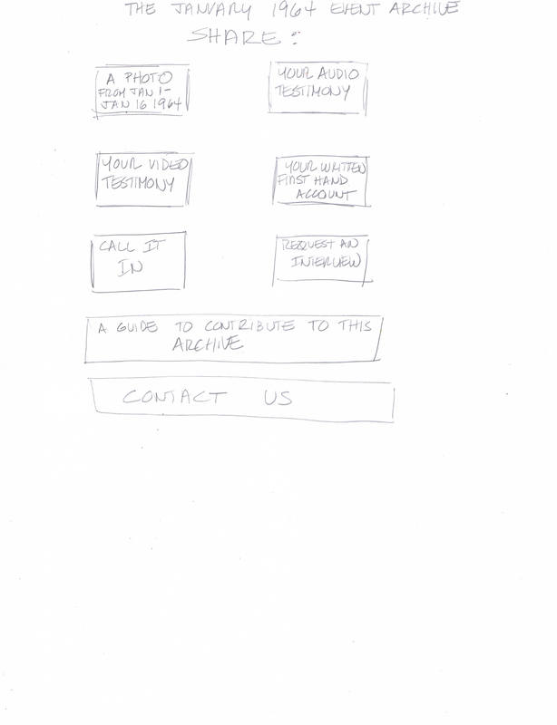
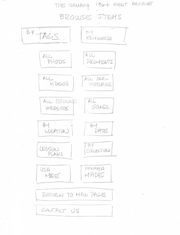
The home page reflects a simple and clean interface since this micro site will be designed primarily for mobile use. Two sub pages were created to conduct user testing with Wanda Witness and Sam Student, which reflect both the oral history and the school research component of the website. A simple paper prototype was designed with two scenarios, one per user. The site´s content was organized into hierarchies of information to test the core navigation concepts.
Test 1: Wanda Witness (WW)
|
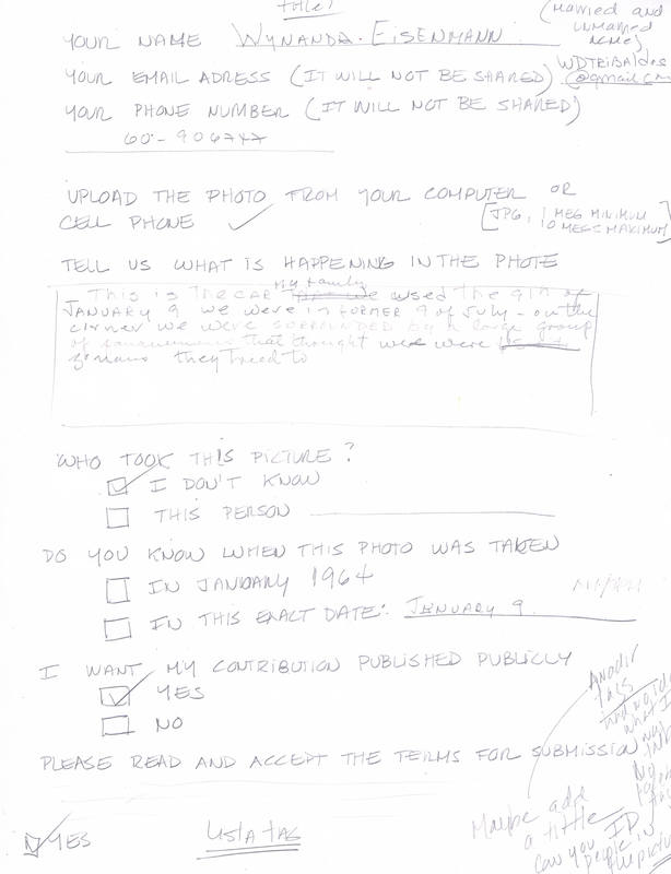
Scenario: As a witness of the January 1964 events, please upload a picture of the events. Please use your finger as your "navigation tool" and describe your thinking process as you move along while on task.
WW was presented with the home page. She easily picked the SHARE YOUR STORY tab. She commented that this was a very clean interface. WW was then shown the sub page SHARE; she did a quick scan and found the A PHOTO JAN 1- JAN 16 1964. She commented she enjoyed that the prototype only offered a few dates to upload, because if not people could upload pictures that did not relate to the historical events. WW then moved to the submission page. She commented that she would like the words: SHARE YOUR PHOTO on the top part to remind the user of the task at hand. WW said the form should include both her single and married surnames, as she was unmarried when the events happened. WW filled the form with little effort. After she finished she inquired if she could tag people in the picture she uploaded, "like she does on Facebook". In the final open-ended interview, she was asked if she would have liked to tag her contribution, and she did not understand what this meant. |
|
|
| ||||||
Test 2: Sam Student (SS)
|
Scenario: As a student looking for information about the January 9th events for homework, how would you navigate this site? Please use your finger as your "navigation tool" and describe your thinking process as you move along while on task.
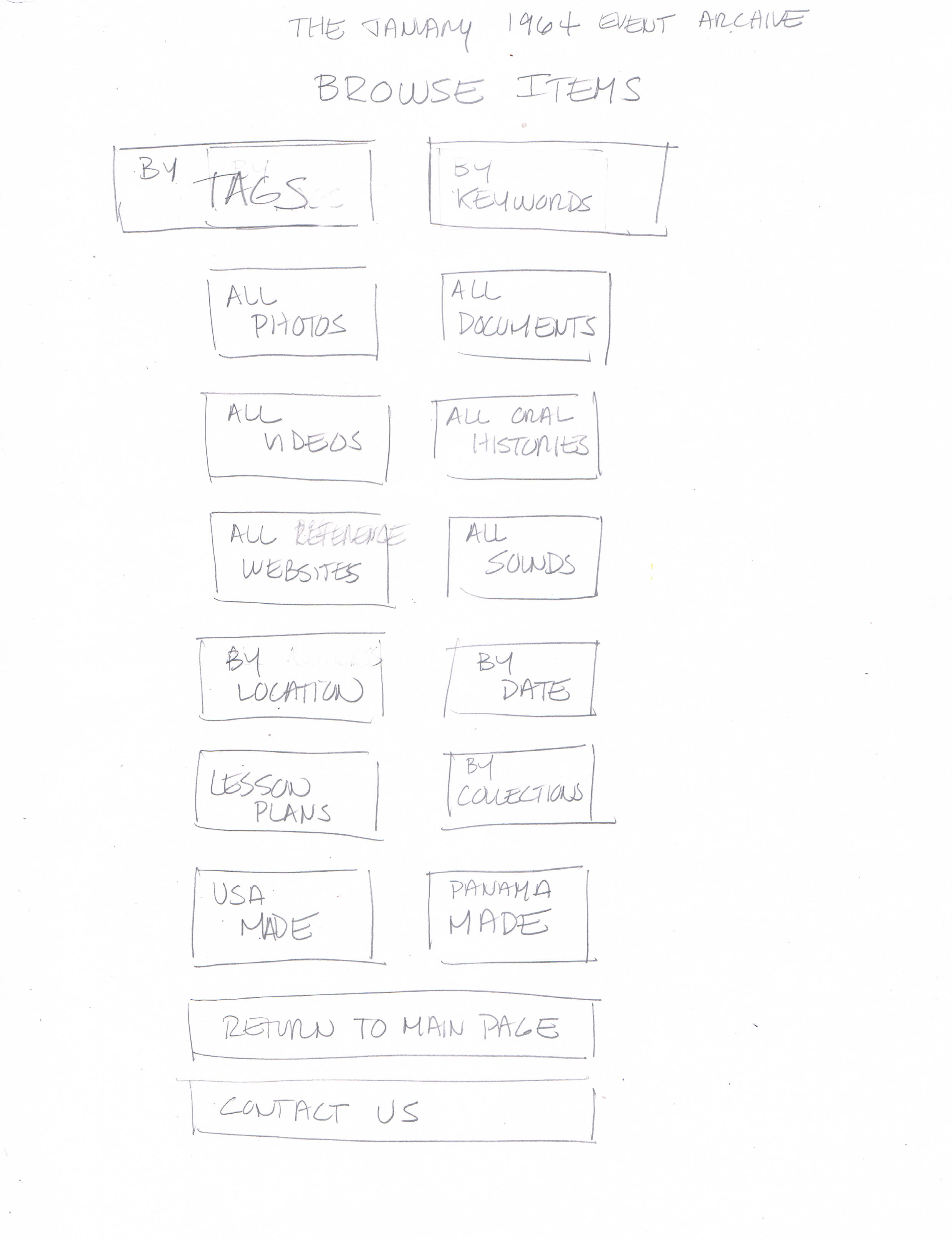
SS was presented with the home page. He picked the ABOUT THE JANUARY 1964 EVENTS button. He said this is where he would find summarized information and the most important links to do his homework. He said he did not understand what PUBLIC PROGRAMS meant; when I explained, he said he preferred a simpler word, like EVENTS. I asked him where he would go for more detailed information; he said that he would go the the SEARCH THE ARCHIVE tab. When he saw this page, SS was confused by the two main tabs. He did not know what TAG meant; he said he would pick a KEYWORD but was not sure which one to pick because he did not "get their meaning". He complained about the many buttons that "confused" him. I explained the buttons were for TYPE of information; SS then suggested creating just two main buttons: BY TAG and BY TYPE, each with a with a sub menu, and then keep a general search tab for the site. He said that he does not want to see tons of buttons on the site because "I want to find information easily", and asked the sub menu to have icons, use short words and be arranged alphabetically. He also warned me that he wanted quick to load pages, because "he gets bored quickly".
|
|
|
| ||||||
Accessibility and usability considerations
The first step before designing this web site will be to gather more information about its users. The design team should conduct at least ten functional wire frames per user personas to collect feedback and inform their judgement for an evolving, agile design process. Developers will strive to test users with varied ages and digital experience levels.
This web site will also be designed for mobile phone navigation first, but should also render well in tablets, laptops and desktop computers. Simplicity and direct access to its most important features will be essential to its navigation. Some elements to be included follow:
This web site will also be designed for mobile phone navigation first, but should also render well in tablets, laptops and desktop computers. Simplicity and direct access to its most important features will be essential to its navigation. Some elements to be included follow:
- All actionable elements will be accessible using a finger or the phone´s keyboard. A mouse will not be a requirement to navigate the site.
- A simplified browsing experience by using mobile-friendly image galleries with swipe gestures.
- A fast-loading site, accomplished by reducing image sizes and other optimization tasks.
- Pages should have has few items as possible without sacrificing usability.
- The ability to easily return to the home page, for example tapping a logo in the top-left section of the menu.
- Large buttons should be used to define where users can or cannot click.
- Text size will be adjustable to accommodate people with vision impairments.
- Drop-down menus should be avoided. If used, they should be activated with a tap and should display a clear separation between options.
- Text input forms should be minimized. The user must automatically advance to the next field when he/she presses Return.
- All images should include descriptive texts so specialized software can be used to read aloud to blind people.
- The site will be created in Spanish. Other users can use Google functionalities to translate its pages.
- Users will be able to share items on social networks and their email.